vue3-loading-shimmer
vue3-loading-shimmer
A customizable Vue 3 component for creating loading shimmer effects
Documentation
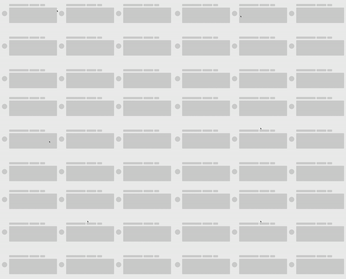
Features
- Customizable background color
- Customizable shimmer color
- Customizable time duration
- Customizable direction
Installation and usage
npm install vue3-loading-shimmer --save
You can use register it globally like this:
import { createApp } from "vue";
import App from "./App.vue";
import vue3LoadingShimmer from "vue3-loading-shimmer";

const app = createApp(App);

app.component("vue3-loading-shimmer", vue3LoadingShimmer);
then use it this in your component:
<vue3-loading-shimmer />
Alternatively, you can use it directly:
<!-- your-component.vue -->

<script setup>
import { defineComponent } from "vue";
import Shimmer from "vue3-loading-shimmer";
// This "Shimmer" can be anything you can to call it e.g:
// import MyShimmer from "vue3-loading-shimmer";
</script>

<template>
  <Shimmer class="whatever" />
</template>

<style>
// you must manually enter its width and height and other properties because we want to give you full control
.whatever {
  height: 200px;
  width: 200px;
  border-radius: 0.5rem;
}
</style>
Browser with CDN
<script src="https://unpkg.com/vue"></script>
<script src="https://unpkg.com/vue3-loading-shimmer"></script>
const { createApp } = Vue;
const App = {
  //Component code...
};
const app = createApp(App);
app.component("Shimmer", Vue3LoadingShimmer);
app.mount("#app");
Available Props
| Prop | Description | Type | Default | Required |
|---|---|---|---|---|
| bgColor | Background color of the wrapper | String | "#d3d3d3" | false |
| shimmerColor | Color of the shimmer effect (MUST BE IN HEX-FORMAT) e.g: "#RRGGBB" or "#RGB" | String | "#ffffff" | false |
| duration | Duration of the shimmer animation in milliseconds | Number | 1400 | false |
| direction | Direction of the shimmer effect | "left-to-right" , "right-to-left", "top-to-bottom", "bottom-to-top" | "left-to-right" | false |
Customize the component by leveraging these props to meet your specific needs.
Related Packages
@ventralnet/vue3-spinkit
A collection of loading indicators animated with CSS for VueJS. Forked for Vue3
1,998
0
Version History
| Version | Released | License |
|---|---|---|
| 1.0.0 | MIT |
Pre-releases (5)
| Version | Released | License |
|---|---|---|
| 0.0.0-beta.5 | MIT | |
| 0.0.0-beta.4 | MIT | |
| 0.0.0-beta.3 | MIT | |
| 0.0.0-beta.2 | MIT | |
| 0.0.0-beta.1 | MIT |