@ventralnet/vue3-spinkit
A collection of loading indicators animated with CSS for VueJS. Forked for Vue3
1,998
| Install | |
|---|---|
npm install @ventralnet/vue3-spinkit |
|
| Latest Version: | 2.0.0 |
| Vue: | 3 |
| License: | MIT |
| Last Updated: | Aug 23, 2024 |
| Links: | GitHub · npm |
Maintainer: ventralnet1
Attention
This is a fork of vue-spinkit that works in vuejs 3. All other documentation should be accurate HOWEVER install this version
npm install --save @ventralnet/vue3-spinkit
vue-spinkit
A collection of loading indicators animated with CSS for VueJS


Inspiration
- Spinkit css animated loading
- react-spinkit
- loaders.css
DEMO
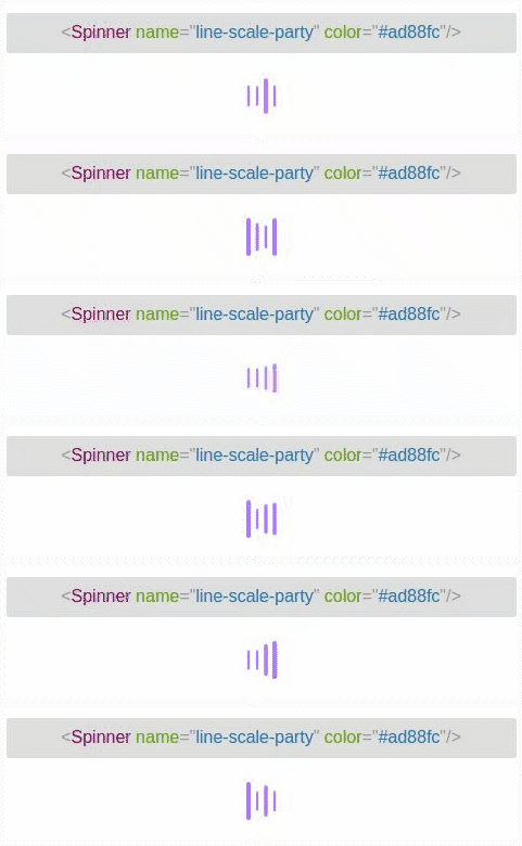
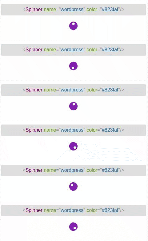
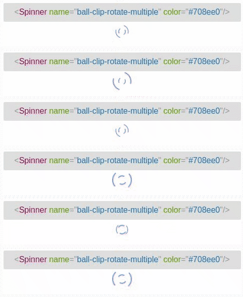

Installation
# use yarn
yarn add @ventralnet/vue3-spinkit
# use npm
npm install --save @ventralnet/vue3-spinkit
How to use
import Spinner from '@ventralnet/vue3-spinkit'

// Register as a component in your component
In file vue
<Spinner name="circle" color="red"/>
Props
| Name | Type | Default | Description |
|---|---|---|---|
| name | string | 'three-bounce' | specify spinner to use (defaults to line-scale-pulse-out-rapid). |
| color | string | programmatically set the color of the spinners; this can either be a hex value or a color word. | |
| noFadeIn | boolean | false | set use fade in |
| fadeIn | string | 'full' | set the time before the spinner fades in. Have 'full', 'half' and 'quarter' |
| className | string | add a custom classname to the outer div | |
| width | string | set width of spinner | |
| height | string | set heght of spinner |
Related Packages
Version History
| Version | Released | Vue | License |
|---|---|---|---|
| 2.0.0 | ^3.2.13 | MIT | |
| 1.0.0 | ^3.2.13 | MIT |