santycss
| Install | |
|---|---|
npm install santycss |
|
| Latest Version: | 2.9.6 |
| Vue: | 3 |
| License: | MIT |
| Last Updated: | Oct 18, 2026 |
| Links: | GitHub · npm |
SantyCSS
Utility-first CSS with plain-English class names. No build step required.





Class names say what they do: add-padding-24 instead of p-6. You can read the markup without a cheat sheet, and so can AI tools.
📖 Docs · 🔎 Class reference · 🎮 Playground · 🧩 Templates · 📝 Changelog · 🤝 Contributing
Latest releases: v2.9.3 – v2.9.4
- The icon stylesheet now ships on npm and the CDN (
santycss/css/icons).- Prettier plugin sorts class lists automatically (
santycss/prettier).npx santycss migrate --from=bootstrapconverts Bootstrap 5 markup.
Quick start
CDN: paste this into <head>:
<link rel="stylesheet" href="https://cdn.jsdelivr.net/npm/santycss@2/dist/santy-start.css">
npm:
npm i santycss
import 'santycss/css/start';
Use it:
<div class="make-flex align-center justify-between gap-16 add-padding-24 background-white round-corners-12 add-shadow-md">
  <h3 class="set-text-20 text-bold color-gray-900">Pro plan</h3>
  <button class="make-button style-primary size-large shape-pill on-hover:scale-105 transition-all">
    Upgrade
  </button>
</div>
That's it. npx santycss init scaffolds a starter page.
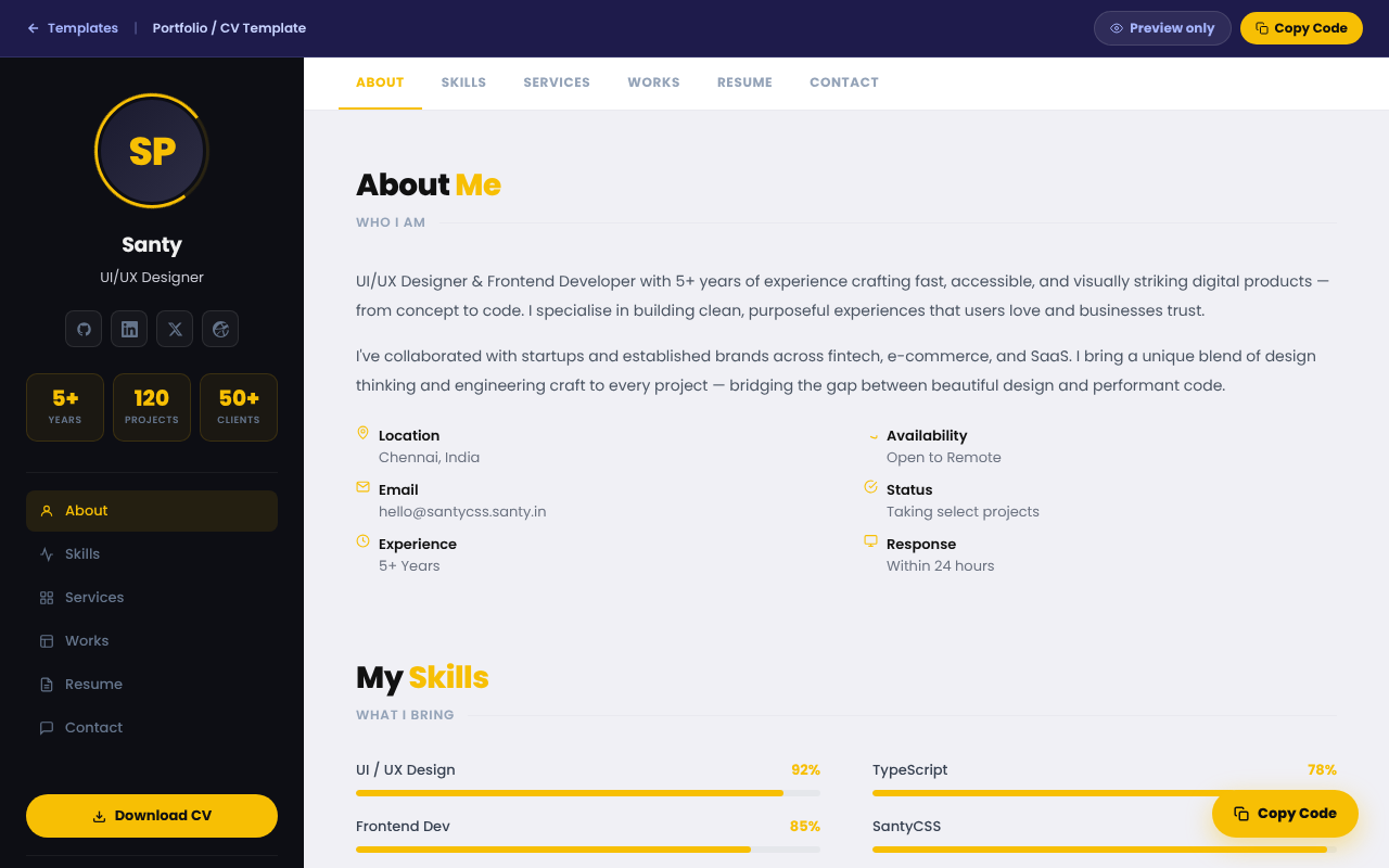
The portfolio template, built with SantyCSS. More in the gallery.
The same card in three frameworks
<!-- Tailwind -->
<div class="flex items-center gap-4 p-6 bg-white rounded-xl shadow-md hover:scale-105 transition">
<!-- Bootstrap -->
<div class="d-flex align-items-center gap-3 p-4 bg-white rounded-3 shadow">
<!-- SantyCSS -->
<div class="make-flex align-center gap-16 add-padding-24 background-white round-corners-12 add-shadow-md on-hover:scale-105 transition-all">
Numbers are pixels (gap-16 = 16px), so there's no spacing scale to memorise.
What's included
- Utilities. Layout, spacing, typography, 20 colour families, borders, shadows, transforms. Responsive, state,
dark:,:has(), ARIA and RTL variants. - Components. Buttons, cards, modals, drawers, tabs, toasts, data tables and more:
make-button style-success size-large shape-pill. - santy.js. A dependency-free behaviour layer.
data-santy-toggle="modal"gives you focus trapping, Esc to close, scroll lock and ARIA wiring. - Framework adapters. Custom elements (
<santy-modal>), React hooks (santycss/react), Vue composables (santycss/vue). - Icons. 2,100+ SVG icons as CSS classes:
<span class="icon icon-house"></span>. Browse them → - Animations. 120+, including scroll-triggered effects and creature animations (
animate-butterfly). See them → - Themes. Semantic tokens (
background-surface,color-text) that flip withdata-theme="dark", plus 5 prebuilt themes. - Config and plugins.
santy.config.jsonfor colours, spacing, breakpoints and a prefix; a plugin API;@applyviasantycss/postcss. - Migrators.
npx santycss migrateconverts Tailwind; add--from=bootstrapfor Bootstrap 5. - Tooling. Prettier class sorting (
santycss/prettier), a VS Code extension and a Figma plugin.
How it compares
| SantyCSS | Tailwind CSS | Bootstrap | |
|---|---|---|---|
| Build step | Optional (CDN works in production) | Required for production | Optional |
| Class style | Plain English, pixel values | Abbreviated, spacing scale | Abbreviated + component classes |
| Ready-made components | ✅ | ❌ (separate products) | ✅ |
| JS behaviour (modals, tabs…) | ✅ santy.js |
❌ | ✅ bootstrap.bundle.js |
| Icons included | ✅ 2,100+ | ❌ | Separate package |
| Theming | CSS variables + 5 themes | Config / CSS variables | Sass + CSS variables |
| Readable by AI without a lookup table | ✅ | Partly | Partly |
| CSS shipped | 53KB gz core, ~15KB gz purged | Only what you use | ~30KB gz |
Trade-offs
- Longer class names mean larger HTML. Gzip removes most of the difference, but the source is wordier.
- The full bundles are large. Use
santy-start.cssorsanty-core.css, or purge (see below). - Choose Tailwind if your team knows it, you rely on its ecosystem, or you need arbitrary values like
w-[37px]. - Choose Bootstrap if you want its Sass pipeline and long track record.
Install options
<!-- Drop-in: base utilities + components -->
<link rel="stylesheet" href="https://cdn.jsdelivr.net/npm/santycss@2/dist/santy-start.css">
<!-- Extended variants: xl:, peer-*, group-*, print:, motion-*, RTL -->
<link rel="stylesheet" href="https://cdn.jsdelivr.net/npm/santycss@2/dist/santy-variants.css">
<!-- Icons -->
<link rel="stylesheet" href="https://cdn.jsdelivr.net/npm/santycss@2/dist/santy-icons.css">
<!-- Behaviour layer -->
<script src="https://cdn.jsdelivr.net/npm/santycss@2/dist/santy.js" defer></script>
With npm: import 'santycss/css' (everything), 'santycss/css/core', 'santycss/css/icons', and so on. PostCSS, Vite and every module import are in the docs.
Sizes
| File | Raw | Gzipped |
|---|---|---|
santy-core.css |
420KB | 53KB |
santy-start.css |
774KB | 111KB |
santy.min.css (everything) |
1.4MB | 163KB |
santy-icons.css |
1.3MB | 247KB |
santy.js |
71KB | 18KB |
| Purged, real page (portfolio template) | 101KB | 15KB |
Purge to the classes you use:
npx santycss purge --input=src --css=node_modules/santycss/dist/santy.min.css --out=dist/santy.css
Naming at a glance
| Pattern | Example | Meaning |
|---|---|---|
add-{prop}-{n} |
add-padding-24, add-shadow-md |
Padding, margin, border, shadow |
make-{thing} |
make-flex, make-pill |
Display, behaviour, component |
set-{prop}-{n} |
set-text-24, set-width-320 |
Sizes |
round-corners-{n} |
round-corners-12 |
Border radius in px |
color-* / background-* |
color-gray-500, background-blue-600 |
Text / background colour |
{variant}:{class} |
md:grid-cols-3, on-hover:scale-105, dark:background-gray-800 |
Breakpoint, state, theme |
Class count. There are 5,100+ base classes. With every responsive, state and dark variant included the classmap lists about 22,600 class names.
Deprecated names
Older docs used these spellings. Use the current names in new code.
| Old | Current |
|---|---|
make-rounded-lg, make-rounded-* |
round-corners-8 (Tailwind rounded-lg = 8px), round-corners-{n} |
make-rounded-full |
make-pill |
tablet:make-block |
md:make-block (768px+) or on-tablet:make-block (640–1023px) |
bg-surface |
background-surface |
text-primary (semantic) |
color-text |
text-muted |
color-text-muted |
npx santycss-migrate |
npx santycss migrate |
bg-surface, text-primary and text-muted still work. The others were documented but never shipped; npx santycss migrate now outputs the current names.
AI integration
santycss.context.mdis a ready-made system prompt. Paste it into your AI tool and it writes SantyCSS instead of Tailwind.santy-classmap.jsonlists every class name. It's also importable assantycss/classmap, for linters, autocomplete and validating AI output.
Links
- 📖 Website · docs · classes · components · icons · browser support
- 🎮 Playground · templates · Webflow guide
- 📝 Changelog · 🤝 Contributing · 🐛 Issues · 💬 Discussions
License and credits
MIT © Santy. Made in India 🇮🇳.
Icons are adapted from Bootstrap Icons (MIT, © The Bootstrap Authors) and Font Awesome Free (CC BY 4.0, © Fonticons, Inc.). See LICENSE for the third-party notices. Brand icons are trademarks of their owners and are included only to identify those brands. Their inclusion does not imply endorsement.
Related Packages
An unplugin for on-demand importing TDesign icons (vue / vue-next / react / web-...
A CSS-first utility framework with semantic tokens, four themes, accessible reci...
Version History
| Version | Released | Vue | License |
|---|---|---|---|
| 2.9.6 | >=3.0.0 | MIT | |
| 2.9.5 | >=3.0.0 | MIT | |
| 2.9.4 | >=3.0.0 | MIT | |
| 2.6.1 | MIT | ||
| 2.5.0 | MIT | ||
| 2.4.8 | MIT | ||
| 2.3.0 | MIT | ||
| 2.2.0 | MIT | ||
| 2.1.0 | MIT | ||
| 2.0.1 | MIT | ||
| 2.0.0 | MIT | ||
| 1.8.0 | MIT | ||
| 1.7.0 | MIT | ||
| 1.6.0 | MIT | ||
| 1.4.0 | MIT | ||
| 1.3.1 | MIT | ||
| 1.3.0 | MIT | ||
| 1.2.0 | MIT | ||
| 1.1.0 | MIT | ||
| 1.0.0 | MIT |