@abvx/ascii-theme
AsciiTheme


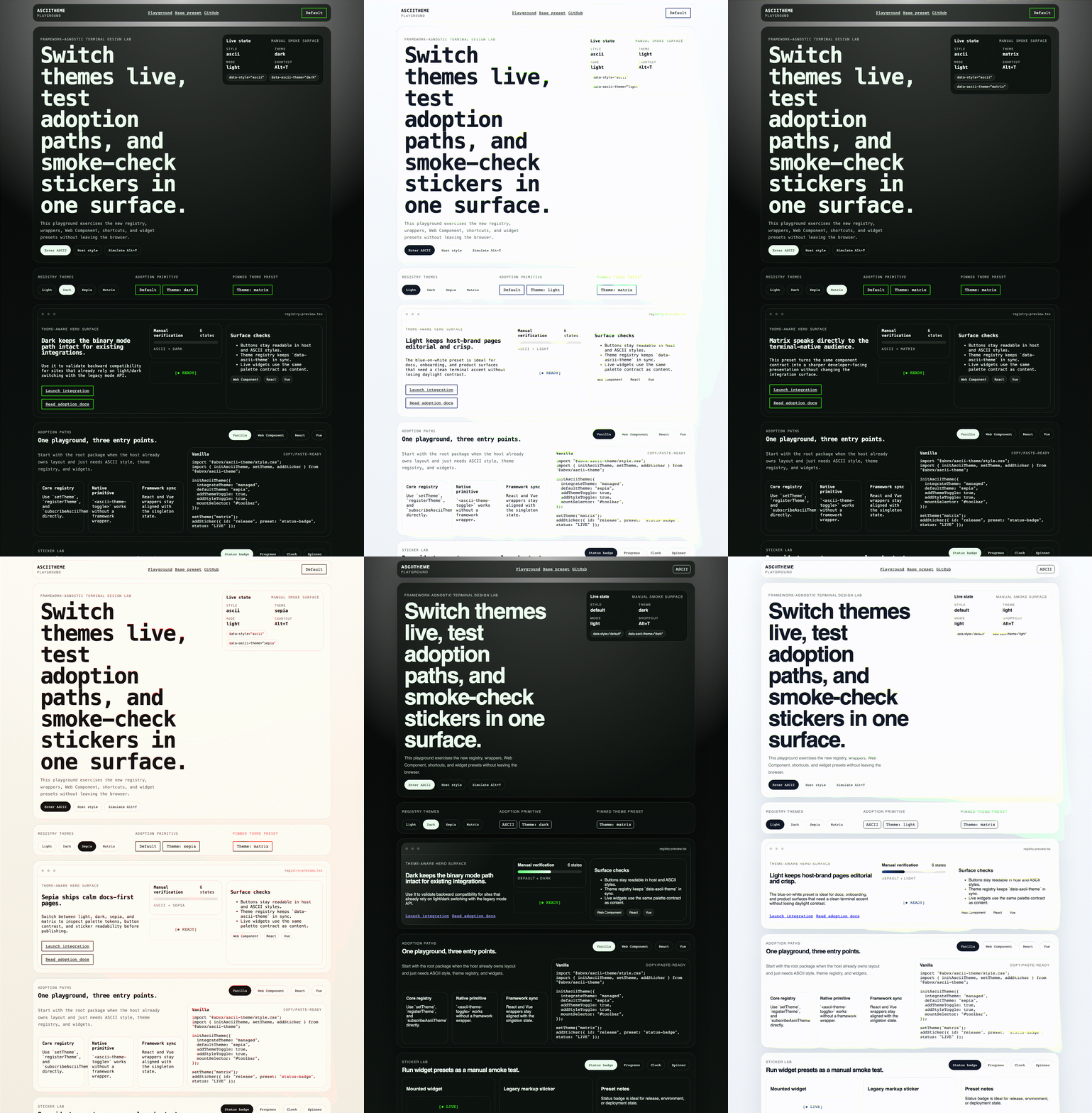
Add an optional ASCII visual layer to an existing site without replacing its design system. AsciiTheme can respect the host theme, manage its own theme, or provide an ASCII-first base preset.
Try the live playground · Install from npm
What it includes
default/asciistyle switching with persistent state- built-in
light,dark,sepia, andmatrixthemes - optional theme and style toggle controls
- ASCII stickers and live
progress,clock,status-badge, andspinnerwidgets - one package with Vanilla, React, Vue, and Web Component entry points
- zero runtime dependencies
Install
npm install @abvx/ascii-theme
import { initAsciiTheme } from "@abvx/ascii-theme";
import "@abvx/ascii-theme/style.css";

initAsciiTheme({
  integrateTheme: "auto",
  addStyleToggle: true,
});
auto detects an existing light/dark theme and leaves it in control. If none exists, AsciiTheme can manage the mode itself.
Choose an integration
| Use case | Import | Start with |
|---|---|---|
| Existing site | @abvx/ascii-theme |
integrateTheme: "auto" |
| ASCII-first page | @abvx/ascii-theme/base.css |
base: true |
| React | @abvx/ascii-theme/react |
AsciiThemeBoot |
| Vue | @abvx/ascii-theme/vue |
createAsciiThemePlugin |
| Web Component | @abvx/ascii-theme/web-component |
<ascii-theme-toggle> |
Managed theme and injected controls
import { initAsciiTheme } from "@abvx/ascii-theme";
import "@abvx/ascii-theme/style.css";

initAsciiTheme({
  integrateTheme: "managed",
  defaultTheme: "matrix",
  addThemeToggle: true,
  addStyleToggle: true,
  mountSelector: "#theme-controls",
});
React
import { AsciiThemeBoot, useAsciiTheme } from "@abvx/ascii-theme/react";
import "@abvx/ascii-theme/style.css";

export function ThemeControls() {
  const theme = useAsciiTheme();

  return (
    <>
      <AsciiThemeBoot options={{ integrateTheme: "auto" }} />
      <button onClick={theme.toggleStyle}>ASCII: {theme.style}</button>
    </>
  );
}
Vue
import { createApp } from "vue";
import { createAsciiThemePlugin } from "@abvx/ascii-theme/vue";
import "@abvx/ascii-theme/style.css";

createApp(App)
  .use(createAsciiThemePlugin({ integrateTheme: "auto" }))
  .mount("#app");
Web Component
import "@abvx/ascii-theme/style.css";
import "@abvx/ascii-theme/web-component";
<ascii-theme-toggle controls="both"></ascii-theme-toggle>
CDN
<link rel="stylesheet" href="https://unpkg.com/@abvx/ascii-theme@0.3.1/dist/style.css">
<script src="https://unpkg.com/@abvx/ascii-theme@0.3.1/dist/ascii-theme.umd.js"></script>
<script>
  AsciiTheme.initAsciiTheme({ addStyleToggle: true });
</script>
Pin the version in production so a future release cannot change the page unexpectedly.
Themes
import { registerTheme, setTheme } from "@abvx/ascii-theme";

registerTheme("amber", {
  label: "Amber terminal",
  mode: "dark",
  ascii: {
    bg: "#160f00",
    fg: "#ffbf47",
    muted: "#b9822d",
    accent: "#ffd27a",
    border: "#8f611f",
  },
});

setTheme("amber");
Stickers and widgets
import { addSticker, updateSticker } from "@abvx/ascii-theme/stickers";

addSticker({
  id: "deploy",
  preset: "progress",
  target: "#build-status",
  value: 35,
  max: 100,
  ariaLabel: "Deployment progress",
});

updateSticker("deploy", { value: 80 });
Use decorative: true for purely visual stickers. Supply ariaLabel when a widget communicates state.
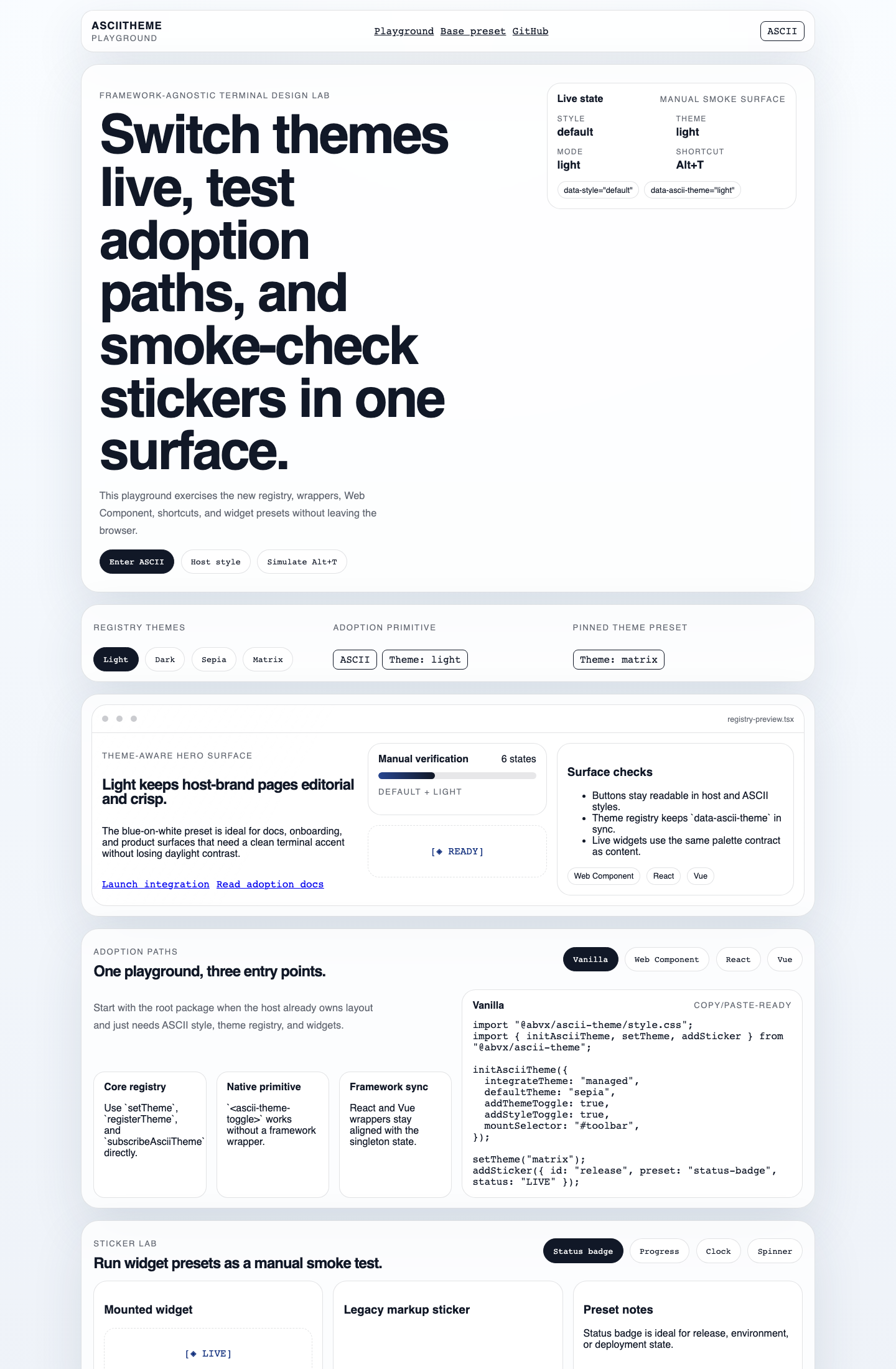
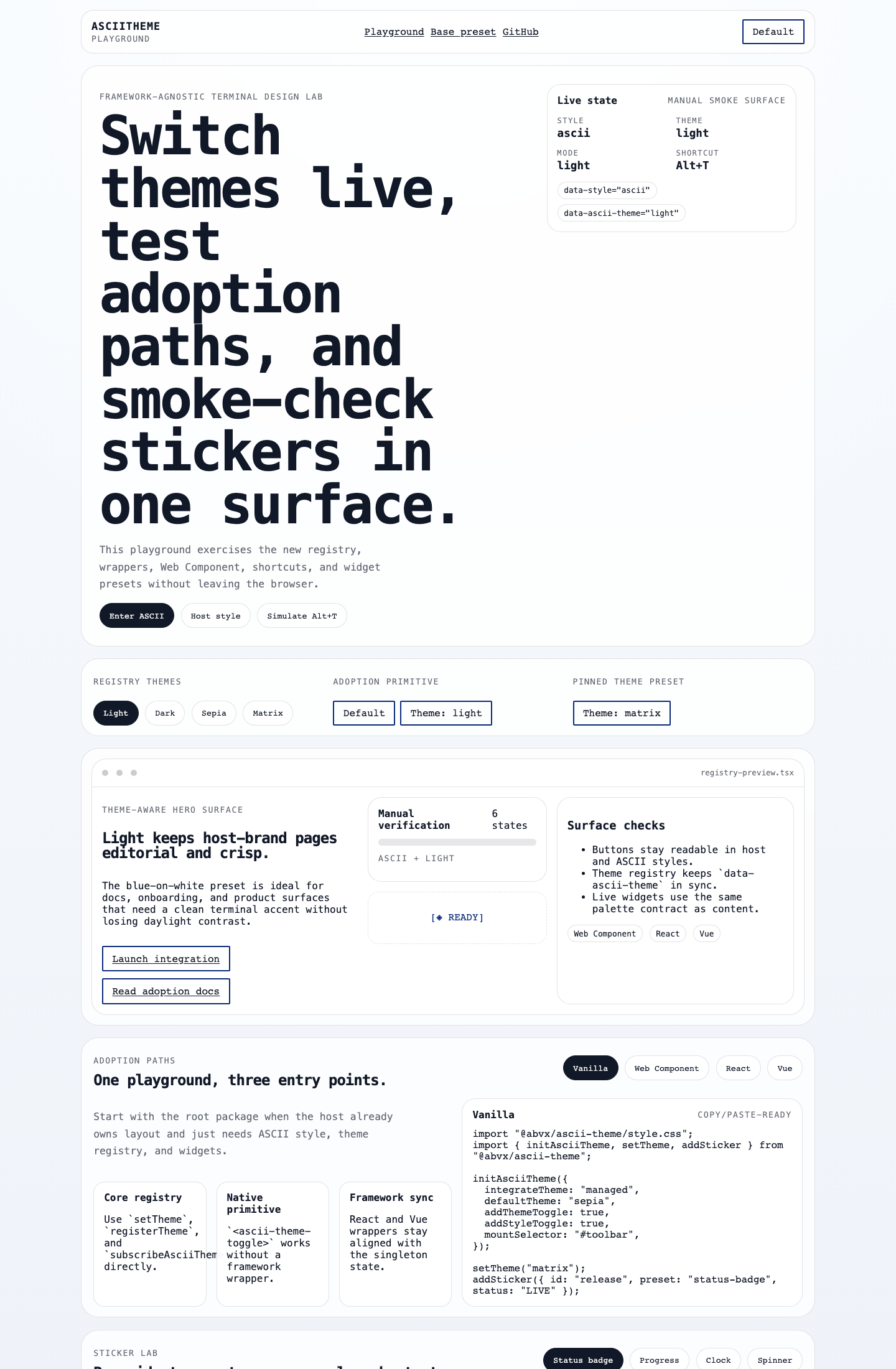
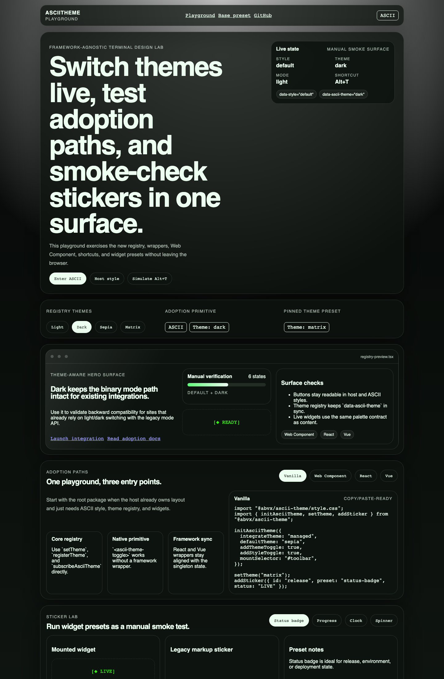
Visual states
| Default | ASCII |
|---|---|
 |
 |
 |
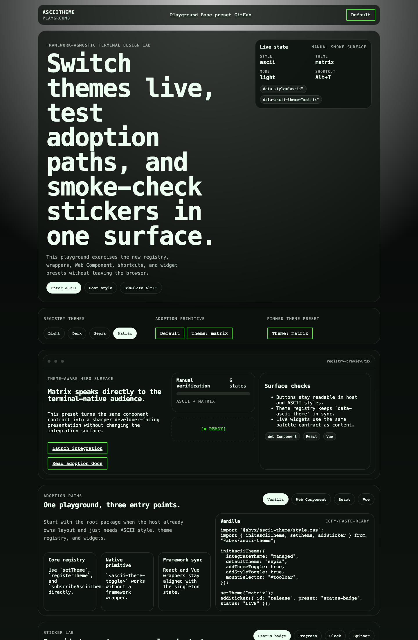 |
The playground also includes ascii + dark and ascii + sepia baselines. See all captured states.
Public API
The root export provides:
- setup:
initAsciiTheme,AsciiTheme - style:
setAsciiStyle,toggleAsciiStyle,getAsciiThemeState - themes:
setTheme,registerTheme,getThemes - mode compatibility:
setAsciiMode,toggleAsciiMode - events:
subscribeAsciiTheme - stickers:
renderAsciiStickers,addSticker,updateSticker,removeSticker
TypeScript declarations ship with every entry point. The package is SSR-safe: initialization becomes a no-op when the DOM is unavailable.
Browser support and scope
AsciiTheme targets modern evergreen browsers. It styles supported HTML patterns and its own utilities; it does not automatically convert arbitrary hardcoded colors or third-party component markup. Start with integrateTheme: "auto" on an established site and review the affected pages visually.
Development
Requires Node.js 20.19+ for the development toolchain.
npm ci
npm run check
npm run demo:dev
npm run check builds the package, runs integration tests, verifies the packed ESM/CJS/framework entry points, builds the demo, and audits dependencies.
More detail:
- playground and visual capture
- integration smoke checks
- release verification
- contributing
- security policy
Related ABVX projects
- ABVX Lab — public project catalog
- AGENTS.md Generator, SET, and ABVX Agent Skills — adjacent agent tooling
- Toki Pona Translator — consolidated Toki Pona toolkit with visual-language integrations
License
Related Packages
NES 8-bit retro-modern design system. Design tokens + class-based CSS components...
A lightweight, framework-agnostic Web Components library built with Stencil
Theme switch animation library built on the View Transitions API. Works with Rea...
Version History
| Version | Released | Vue | License |
|---|---|---|---|
| 0.3.1 | ^3.4.0 || | MIT | |
| 0.2.0 | MIT |