vue-simple-arc
SimpleArc
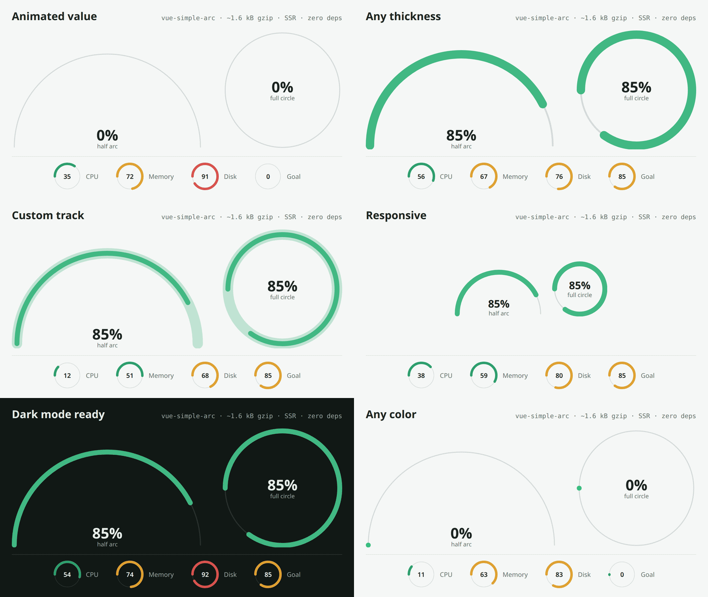
Lightweight Vue 3 SVG arc / circle progress component. Animated, responsive, accessible, server-side rendered and with zero runtime dependencies (~1.6 kB gzip).
Installation
npm i vue-simple-arc
Import
import { SimpleArc } from 'vue-simple-arc';
// or: import SimpleArc from 'vue-simple-arc';
SimpleArcComponentis still exported as an alias ofSimpleArcfor backward compatibility.
TypeScript
The props type is exported:
import type { SimpleArcProps } from 'vue-simple-arc';
Usage
<SimpleArc
    :value="percentage"
    width="350px"
    :fullCircle="false"
    :thickness="8"
    color="#41b883"
    trackColor="#80808040"
    aria-label="Sales goal"
>
    <strong>{{ Math.round(percentage * 100) }}%</strong>
</SimpleArc>
Props
| Prop | Type | Required | Default | Description |
|---|---|---|---|---|
value |
Number | yes | — | Progress between 0 and 1. Values outside this range are clamped; NaN is treated as 0. |
width |
String | no | '100%' |
Any CSS width. The arc redraws when the container is resized. |
fullCircle |
Boolean | no | false |
Draws a full circle instead of a half arc. |
thickness |
Number | no | 8 |
Progress line thickness in px. |
trackThickness |
Number | no | thickness / 5 |
Background line (track) thickness in px. |
color |
String | no | '#41b883' |
Color of the progress line. |
trackColor |
String | no | '#80808040' |
Color of the background line. The default is visible on light and dark backgrounds. |
secondColor |
String | no | — | Deprecated, use trackColor. Still works as an alias and logs a warning once. |
Animation
Value changes animate with a CSS transition on the progress line, including from and back to 0. Customize it with CSS variables on the component or any ancestor:
| Variable | Default | Description |
|---|---|---|
--simple-arc-duration |
0.4s |
Transition duration. Use 0s to disable it. |
--simple-arc-easing |
ease |
Transition timing function. |
.my-gauge { --simple-arc-duration: 1s; --simple-arc-easing: cubic-bezier(.2, .8, .2, 1); }
The animation is turned off automatically when the user prefers reduced motion. Resizing never triggers it.
SSR / Nuxt
The arc is fully rendered on the server, so there is no empty SVG waiting for hydration. Before the component is mounted it draws with a 200px reference width and scales it to the container: in larger containers the line looks proportionally thicker, and the height can shift by a few pixels (proportional to thickness) once hydration measures the real width.
Migrating from 0.2
No breaking changes. secondColor still works but is deprecated: rename it to trackColor. The track thickness can now be set with trackThickness (the default stays thickness / 5).
Slot
The default slot is placed at the bottom center of the half arc, or at the center of the full circle. It inherits the parent's font size and color.
Accessibility
The root element has role="progressbar", aria-valuemin="0", aria-valuemax="100" and aria-valuenow (the value as a percentage). Pass aria-label or aria-labelledby to describe what is being measured.
Related Packages
Circular gauge component for Vue.js with customizable colors, animations, and th...
Framework-agnostic dashboard widget toolkit: typed widget definitions and data p...
Zero-dependency Vue 3.5+ star rating component — WCAG 2.2 accessible, TypeScript...
Version History
| Version | Released | Vue | License |
|---|---|---|---|
| 0.3.0 | ^3.3.0 | MIT | |
| 0.2.0 | ^3.3.0 | MIT | |
| 0.1.4 | ^3.0.0 | MIT | |
| 0.1.3 | ^3.0.0 | ||
| 0.1.2 | ^3.0.0 | ||
| 0.1.1 | ^3.0.0 | ||
| 0.1.0 | ^3.0.0 |