vue-pithy-progress
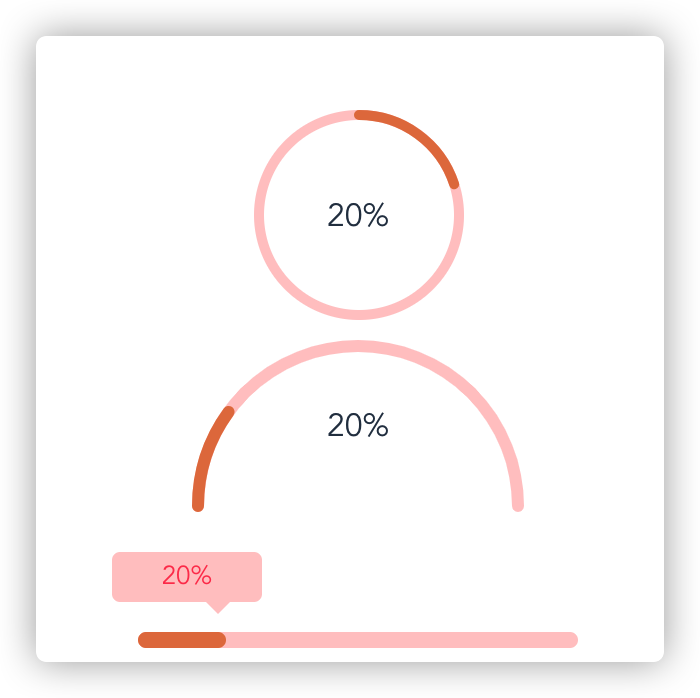
Progress bar component for Vue.js(2.x). This project contains three common components(circle-progress、semi-circle-progres、progress-bar)uses SVG to show progress.
2,099
| Install | |
|---|---|
npm install vue-pithy-progress |
|
| Latest Version: | 0.1.1 |
| Vue: | 2 |
| License: | MIT |
| Last Updated: | Sep 16, 2020 |
| Links: | npm |
Maintainer: zbest
vue-pithy-progress
Progress bar component for Vue.js(2.x). This project contains three common components(circle-progress、semi-circle-progres、progress-bar)uses SVG to show progress.
English|中文
Installation
npm install vue-pithy-progress
Usage
Global registration
import VuePithyProgress from 'vue-pithy-progress'
import 'vue-pithy-progress/dist/vue-pithy-progress.css'
Vue.use(VuePithyProgress)

<circle-progress :percentage="percentage"> </circle-progress>

<semi-circle-progress :percentage="percentage" />

<progress-bar :percentage="percentage" />
Use single component
import semiCircleProgress from 'vue-pithy-progress/lib/semi-circle-progress.umd.min.js'
import 'vue-pithy-progress/lib/semi-circle-progress.css'

<semi-circle-progress :percentage="percentage" />

export default {
  name: 'App',
  data() {
    return {
      percentage: 10
    }
  },
  components: { semiCircleProgress }
}
demo
<template>
  <div id="app">
    <div class="con">
      <circle-progress :percentage="percentage"> </circle-progress>
    </div>
    <div style="margin-top:10px;">
      <semi-circle-progress :percentage="percentage" />
    </div>
    <div style="width:220px; margin-top:60px;">
      <progress-bar :percentage="percentage" />
    </div>

    <div class="btn-wrapper" style="margin-top:10px;">
      <button @click="changeProgrss">increase</button>
    </div>
  </div>
</template>

<script>

export default {
  name: 'App',
  data() {
    return {
      percentage: 10
    }
  },
  methods: {
    changeProgrss() {
      this.percentage += 10
    }
  }
}
</script>
circle-progress
props
| Name | Default value | Type | Description |
|---|---|---|---|
| percentage | 0 | Number | Rate of progress. |
| r | 50 | Number | Radius of circle. |
| stroke-width | 5 | Number | The width of the progress bar. |
| bg-color | #ffffff | String | The background color of the circle. |
| stroke-bg-color | #ffcaca | String | The background color of the progress bar. |
| stroke-color | #e57d4b | String | The color of progress bar. |
| stroke-linecap | round | String | The type of stroke linecap for circle.(sqaure butt round) |
| duration | 0.3 | Number | Transition time for progress changes. |
slots
| Name | Description |
|---|---|
| default | custom text content. |
semi-circle-progress
props
| Name | Default value | Type | Description |
|---|---|---|---|
| percentage | 0 | Number | Rate of progress. |
| r | 50 | Number | Radius of circle. |
| stroke-width | 5 | Number | The width of the progress bar. |
| bg-color | #ffffff | String | The background color of the circle. |
| stroke-bg-color | #ffcaca | String | The background color of the progress bar. |
| stroke-color | #e57d4b | String | The color of progress bar. |
| stroke-linecap | round | String | The type of stroke linecap for circle.(sqaure butt round) |
| duration | 0.3 | Number | Transition time for progress changes. |
slots
| Name | Description |
|---|---|
| default | custom text content. |
progress-abr
props
| Name | Default value | Type | Description |
|---|---|---|---|
| percentage | 0 | Number | Rate of progress. |
| height | 8 | Number | Height of progress bar. |
| unit | px | String | The css pixel unit. |
| width | 100% | String | The width of progress bar. |
| bg-color | #ffcaca | String | The background color of the progress bar. |
| color | #e57d4b | String | The font color of progress bar. |
| show-top-tip | true | Boolean | Show top tips of progress bar. |
| tip-bg-color | #ffcaca | String | Background color of top tips. |
| tip-font-color | #ff445a | String | Font color of top tips. |
slots
| Name | Description |
|---|---|
| default | custom text content(Top tip). |
Dev
npm install
npm run serve
build
npm run build
License
MIT
Related Packages
vue3-circle-progress
A circular progressbar component for Vue 3, built with SVG and extensively custo...
393,857
41
vue-js-progress
With Vue Js Progress, you will have the opportunity to create your own animated...
3,051
@marcoschulte/vue3-progress
A fully customizable vue3 plugin to display a progress bar while waiting for som...
72,095
25
Version History
| Version | Released | Vue | License |
|---|---|---|---|
| 0.1.1 | ^2.6.11 | MIT | |
| 0.1.0 | ^2.6.11 | MIT |