vue-cat-carousel
vue-cat-carousel is a slider component of Vue.js.
2,408
14
| Install | |
|---|---|
npm install vue-cat-carousel@0.9.3 |
|
| Latest Version: | 0.9.3 |
| Vue: | 2 |
| License: | MIT |
| Last Updated: | Jan 5, 2023 |
| Links: | GitHub · npm |
Maintainer: hans_sagita
🐱🐱🐱 Vue-Cat-Carousel 🐱🐱🐱
Simple, customizable, reactive and lightest Carousel
Install
npm i -S vue-cat-carousel
or
npm install --save vue-cat-carousel
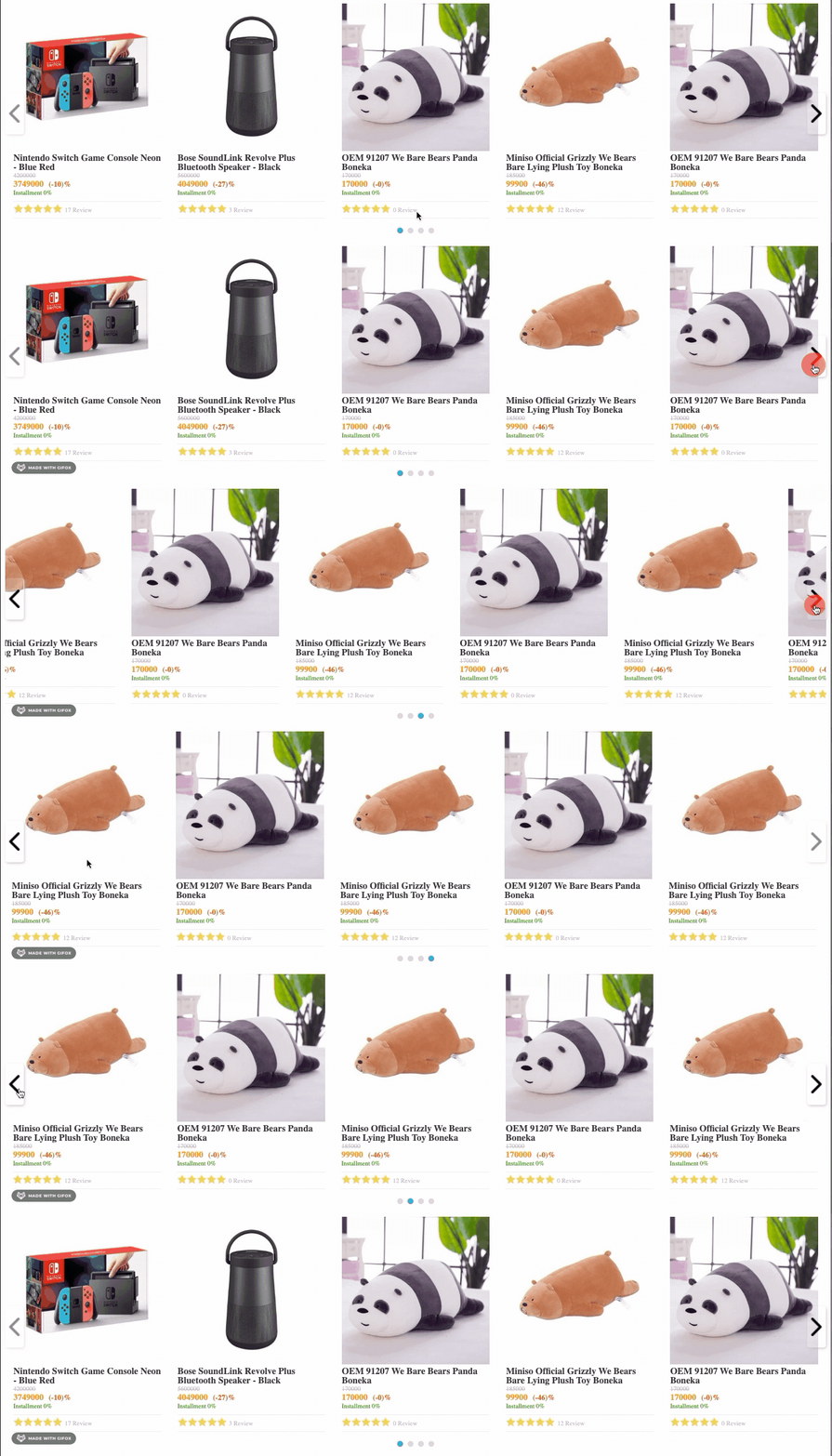
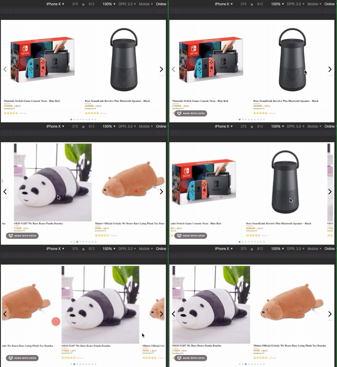
Preview
Desktop Preview
Mobile Preview
Usage
Plugin install:
Global install
import Vue from 'vue'
import CatCarousel from 'vue-cat-carousel'

Vue.use(CatCarousel)
Local install
components: {
  CatCarousel: () => import('vue-cat-carousel')
}
How to use it in HTML
<cat-carousel
    :items="items"
    :item-per-page="5"
    :indicators-config="{activeColor: '#000', size: 10, color: '#d1d1d1', hideIndicators: false}"
  >
    <template
      slot="item"
      slot-scope="{data, index}"
    >
      <div class="item">{{index}} {{data.name}} </div>
    </template>
  </cat-carousel>
import { CatCarousel } from 'vue-cat-carousel'

new Vue({
  el: 'body',
  components: {
    CatCarousel
  },
  data() {
    return {
      items: [{name: 'hans'}, {name: 'sagita'}]
    }
  }
})
Props
Slider:
| name | type | default | description |
|---|---|---|---|
| items | list | [] | List of items in loop |
| item-per-page | number | 5 | List of items in one page |
| centerMode | Object | CENTER_MODE_DEFAULT_CONFIG | Allow to center carousel item with partial prev/next slides |
| indicators-config | Object | INDICATORS_DEFAULT_CONFIG | define carousel indicators item size |
INDICATORS_DEFAULT_CONFIG
| property | type | value | description |
|---|---|---|---|
| size | number | 16 | size of indicators in pixel |
| color | string | '#d6d6d6' | color of indicators (hex, rgb, etc) |
| activeColor | string | '#0095da' | color of active indicator (hex, rgb, etc) |
| hideIndicators | boolean | false | show and hide carousel indicators |
| prefix | string | '' | add prefix for :key item name |
INDICATORS_DEFAULT_CONFIG
| property | type | value | description |
|---|---|---|---|
| enabled | boolean | false | enable center mode carousel |
| paddingCenter | number | 10 | sizes of padding in percentage |
Slots
| slot | slot-scope | description |
|---|---|---|
| item | data, index | customize the design of carousel item |
| prev-navigation | prev | customize slide left navigation |
| next-navigation | next | customize slide right navigation |
Previous navigation:
<cat-carousel
    :items="items"
    :item-per-page="5"
    :indicators-config="{activeColor: '#000', size: 10, color: '#d1d1d1', hideIndicators: false}"
  >
    <template
      slot="prev-navigation"
      slot-scope="{prev}"
    >
      <div class="custom-navigation" @click="prev"></div>
    </template>
  </cat-carousel>
Next navigation:
<cat-carousel
    :items="items"
    :item-per-page="5"
    :indicators-config="{activeColor: '#000', size: 10, color: '#d1d1d1', hideIndicators: false}"
    :prefix="'nike'"
  >
    <template
      slot="prev-navigation"
      slot-scope="{next}"
    >
      <div class="custom-navigation" @click="next"></div>
    </template>
  </cat-carousel>
Center mode carousel:
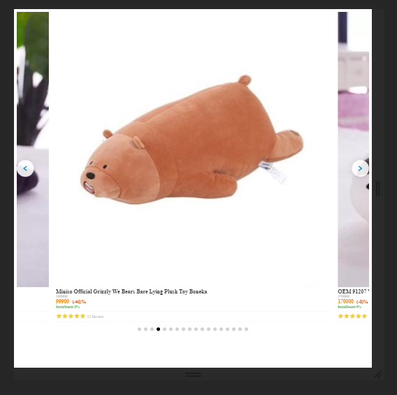
<cat-carousel
    :items="items"
    :item-per-page="5"
    :centerMode="{enabled: true, paddingCenter: 10}"
    :indicators-config="{activeColor: '#000', size: 10, color: '#d1d1d1', hideIndicators: false}"
  >
  </cat-carousel>
License
MIT
Related Packages
vue-card-carousel
A flexible, touch-focused wrapper element that displays cards in a carousel-like...
3,487
5
vue2-datetime-picker
vue2-datetime-picker is a vue2.0 compatible date time picker component. It is a...
1,011
1
Version History
| Version | Released | Vue | License |
|---|---|---|---|
| 0.9.3 | ^2.6.10 | MIT | |
| 0.9.2 | ^2.6.10 | MIT | |
| 0.9.1 | ^2.6.10 | MIT | |
| 0.9.0 | ^2.6.10 | MIT | |
| 0.8.4 | ^2.6.10 | MIT | |
| 0.8.3 | ^2.6.10 | MIT | |
| 0.8.2 | ^2.6.10 | MIT | |
| 0.8.1 | ^2.6.10 | MIT | |
| 0.8.0 | ^2.6.10 | MIT | |
| 0.7.3 | ^2.6.10 | MIT | |
| 0.7.2 | ^2.6.10 | MIT | |
| 0.7.1 | ^2.6.10 | MIT | |
| 0.7.0 | ^2.6.10 | MIT | |
| 0.6.0 | ^2.6.10 | MIT | |
| 0.5.0 | ^2.6.10 | MIT | |
| 0.4.0 | ^2.6.10 | MIT | |
| 0.3.0 | ^2.6.10 | MIT | |
| 0.2.0 | ^2.6.10 | ||
| 0.1.0 | ^2.6.10 |
Pre-releases (6)
| Version | Released | Vue | License |
|---|---|---|---|
| 0.9.3-6 | ^2.6.10 | MIT | |
| 0.9.3-5 | ^2.6.10 | MIT | |
| 0.9.3-4 | ^2.6.10 | MIT | |
| 0.9.3-3 | ^2.6.10 | MIT | |
| 0.9.3-2 | ^2.6.10 | MIT | |
| 0.9.3-1 | ^2.6.10 | MIT |