oyna-ui
| Install | |
|---|---|
npm install oyna-ui |
|
| Latest Version: | 0.2.1 |
| Vue: | 3 |
| License: | MIT |
| Last Updated: | Oct 9, 2026 |
| Links: | GitHub · npm |
Oyna UI
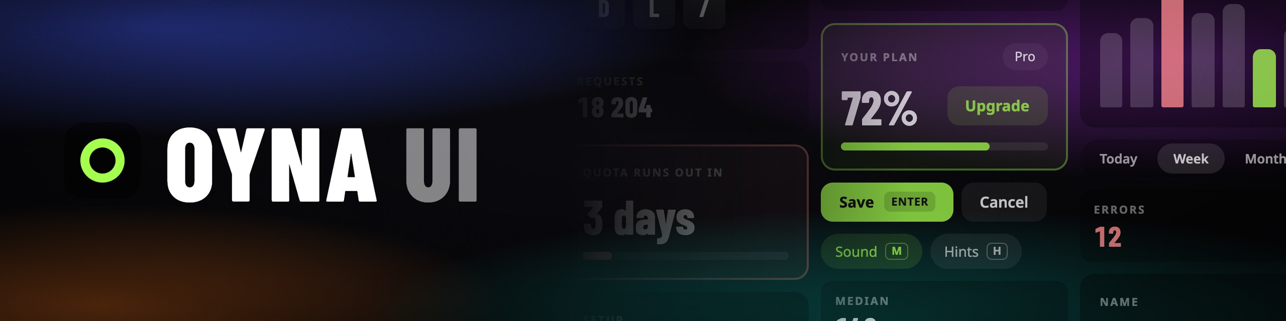


A Vue 3 component library. Plain CSS, hotkeys built in.
Docs, installation and live examples: oyna-ui.org. For an AI assistant: oyna-ui.org/llms.txt.
What you get
- 42 components, each with a docs page and a live example.
- Plain CSS. One stylesheet, about 7 kB gzipped. No Tailwind or UnoCSS, no build plugin, no config file. If you use one of them, the tokens are there as its utilities.
- CSS variables. Colours, radii and fonts are
--o-*variables: set them on:rootor on one part of the page. There is a theme editor. - Hotkeys. A button or a toggle shows its key and reacts to it. Keys are read by position, so they work on any keyboard layout, and they are off while the user types.
- A background. Generated in CSS, no image files.
- Reka UI underneath. The one runtime dependency. Dialogs, menus, selects and tooltips get focus handling, keyboard navigation and ARIA from it.
- ESM, typed, tree-shakable. One file per component, TypeScript types included.
- Reduced motion. One variable turns every transition off.
Not included, and not planned: a light theme, a data grid, a date picker, a tree view.
Why it exists
I was building invoke.wtf, a trainer for Invoker from Dota 2, and wanted a UI kit that looked the way I had in mind: dark glass, no grey borders, everything on the keyboard. The Vue kits I tried all looked like admin panels, so I drew the interface by hand.
Oyna UI is that look taken out of the project and made into a library. I made it for myself. If it suits your project, use it too. Oyna is Uzbek for "glass", and also for "window" and "mirror".
The rules the components follow are on Why Oyna UI.
Development
bun install
bun run dev          # playground
bun run docs:dev     # docs site
bun run fmt          # format with oxfmt
bun run lint && bun run typecheck && bun run test && bun run build
bun run pack:check   # the packed library in a fresh Vite project
The repository is developed with Bun; to use the library, any package manager works.
typecheck needs Node on your PATH; the rest runs on Bun alone.
How to propose a change: CONTRIBUTING.md. AGENTS.md has the structure, the conventions and the open decisions. Changes are in CHANGELOG.md.
License
Related Packages
Librería de componentes UI en Vue 3 + TypeScript para estandarizar estilos entre...
Banxa's Vue 3 design system — accessible, themeable components built on a CSS cu...
Cocoar Design System — a touch-first Vue 3 component library with 30+ accessible...
Version History
| Version | Released | Vue | License |
|---|---|---|---|
| 0.2.1 | ^3.5.0 | MIT | |
| 0.2.0 | ^3.5.0 | MIT | |
| 0.1.1 | ^3.5.0 | MIT | |
| 0.1.0 | ^3.5.0 | MIT |