@vuesimple/vs-alert
A simple vue alert. Perfect for all your alert scenarios.
5,598
33
| Install | |
|---|---|
npm install @vuesimple/vs-alert |
|
| Latest Version: | 3.1.8 |
| Vue: | 3 |
| Older releases: | 2 |
| License: | MIT |
| Last Updated: | Oct 14, 2026 |
| Links: | GitHub · npm |
Maintainer: ashwinkshenoy
Vue Simple Alert
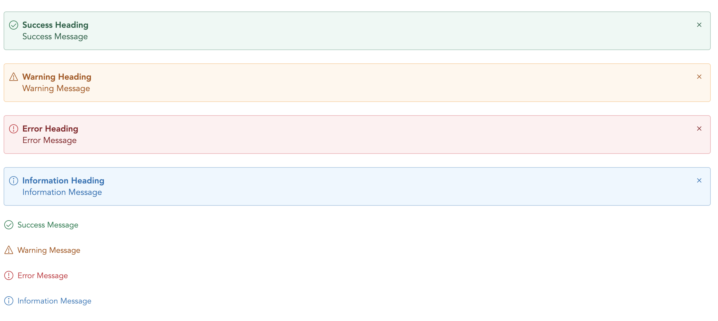
🗃 A simple vue alert. Perfect for all your alert scenarios.
A light weight vue plugin built groundup.


📺 Live Demo
Demo: Link
🛠 Install
npm i @vuesimple/vs-alert
🚀 Usage
<template>
  <vs-alert variant="success"> Success </vs-alert>
</template>

<script>
  import VsAlert from '@vuesimple/vs-alert';

  export default {
    components: {
      VsAlert,
    },
  };
</script>
🌎 CDN
<script src="https://unpkg.com/@vuesimple/vs-alert@<version>/dist/vs-alert.min.js"></script>
// Main/Entry file
app.use(VsAlert.plugin);
<template>
  <vs-alert variant="success"> Success </vs-alert>
</template>
⚙ Props
| Name | Type | Default | Description |
|---|---|---|---|
| variant | String | - | Type of alert to be shown. (success, warning, error, info, secondary) |
| title | String | - | The alert title (text only). For HTML, use the header slot. |
| showClose | Boolean | false | Show alert close icon |
| small | Boolean | false | Applies reduced padding |
| toast | Boolean | false | Applies toast design |
| noBg | Boolean | false | Remove background color |
🔥 Events
| Name | Description |
|---|---|
| close | Emitted when the alert close icons is clicked. Listen for it using @close. |
📎 Slots
You can define own item markup via slots:
| Name | Description |
|---|---|
| (default) | Holds the alert content and can contain HTML. |
| icon | Slot to add custom icon for type |
| title | Slot to add custom title |
Related Packages
Version History
| Version | Released | Vue | License |
|---|---|---|---|
| 3.1.8 | ^3.2.37 | MIT | |
| 3.1.7 | ^3.2.37 | MIT | |
| 3.1.6 | ^3.2.37 | MIT | |
| 3.1.5 | ^3.2.37 | MIT | |
| 3.1.3 | ^3.2.37 | MIT | |
| 3.1.2 | ^3.2.37 | MIT | |
| 3.0.9 | ^3.2.37 | MIT | |
| 3.0.8 | ^3.2.37 | MIT | |
| 3.0.7 | ^3.2.37 | MIT | |
| 3.0.6 | ^3.2.37 | MIT | |
| 3.0.5 | ^3.2.37 | MIT | |
| 3.0.4 | ^3.2.37 | MIT | |
| 3.0.3 | ^3.2.37 | MIT | |
| 3.0.2 | ^3.2.37 | MIT | |
| 3.0.1 | ^3.2.37 | MIT | |
| 3.0.0 | ^3.2.37 | MIT | |
| 1.4.18 | 2.6.10 | MIT | |
| 1.4.15 | 2.6.10 | MIT | |
| 1.4.14 | 2.6.10 | MIT | |
| 1.4.13 | 2.6.10 | MIT | |
| 1.4.12 | 2.6.10 | MIT | |
| 1.4.11 | 2.6.10 | MIT | |
| 1.4.10 | 2.6.10 | MIT | |
| 1.4.9 | 2.6.10 | MIT | |
| 1.4.8 | 2.6.10 | MIT | |
| 1.4.6 | 2.6.10 | MIT | |
| 1.4.5 | 2.6.10 | MIT | |
| 1.4.4 | 2.6.10 | MIT | |
| 1.4.3 | 2.6.10 | MIT | |
| 1.4.2 | 2.6.10 | MIT |
Showing the latest 30 of 58. See every release on npm