@alikhalilll/a-tel-input
| Install | |
|---|---|
npm install @alikhalilll/a-tel-input |
|
| Latest Version: | 1.4.5 |
| Vue: | 3 |
| License: | MIT |
| Last Updated: | Oct 5, 2026 |
| Links: | GitHub · npm |
@alikhalilll/a-tel-input
A headless, shadcn-vue style international telephone input for Vue 3 / Nuxt 3+. Country auto-detect · libphonenumber-js validation · responsive picker (popover ⇆ drawer) · RTL & i18n ready · first-class VeeValidate + Zod integration · server-side validation hook.
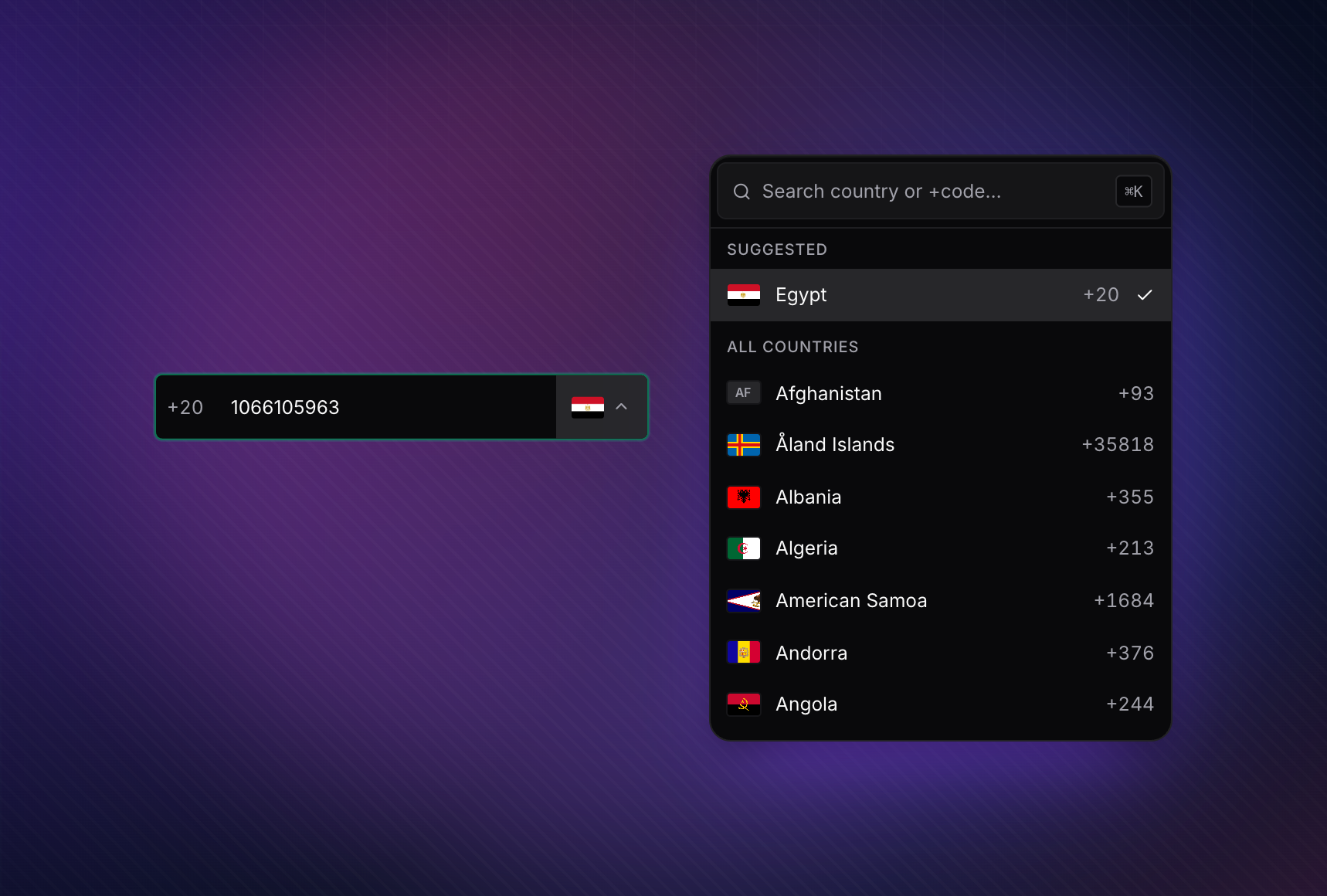
Headless picker — popover on desktop, bottom-sheet on mobile.


Setup
Nuxt 3 / 4
pnpm add @alikhalilll/a-tel-input
# npm install @alikhalilll/a-tel-input
# yarn add @alikhalilll/a-tel-input
# bun add @alikhalilll/a-tel-input
// nuxt.config.ts
export default defineNuxtConfig({
  modules: ['@alikhalilll/a-tel-input/nuxt'],
  css: ['@alikhalilll/a-tel-input/styles.css'],
});
ATelInput, ACountrySelect, and ACountryFlag are auto-imported — no import statement needed in your .vue files.
Vue + Vite
pnpm add @alikhalilll/a-tel-input
// main.ts
import '@alikhalilll/a-tel-input/styles.css';
Optional auto-resolve via unplugin-vue-components:
// vite.config.ts
import Components from 'unplugin-vue-components/vite';
import { ATelInputResolver } from '@alikhalilll/a-tel-input/resolver';

export default { plugins: [Components({ resolvers: [ATelInputResolver()] })] };
REST Countries v5 (optional)
The component renders with a synchronous, offline country list built from libphonenumber-js + Intl.DisplayNames — no network, no auth. Pass restCountriesApiKey to opt into the v5 fetch (one request per browser, cached in localStorage for 30 days):
// nuxt.config.ts — applies app-wide
export default defineNuxtConfig({
  modules: ['@alikhalilll/a-tel-input/nuxt'],
  aTelInput: { apiKey: 'rc_live_...' },
});
<!-- Per-component override -->
<ATelInput :rest-countries-api-key="myKey" v-model="phone" />
// Vue + Vite — install once at bootstrap
import { installTelInputDefaults } from '@alikhalilll/a-tel-input';
installTelInputDefaults(app, { apiKey: 'rc_live_...' });
Per-component props win over the injected default. Any failure (CORS, network, non-2xx) silently falls back to the offline baseline — never an empty dropdown. CORS requires you to allowlist your origin's hostnames on the REST Countries dashboard.
Why this component
- Universal country detection — debounced parse against the full libphonenumber
metadata (~250 countries). Works with international format (
+201066105963) AND local format (01066105963), with NANP disambiguation and a hint-priority chain (env → current → recents → popular → all). No "only the popular countries" caveats. - Validates and formats — error reasons, format hint, E.164 output, every keystroke.
- Responsive surface — popover on desktop, bottom-sheet drawer on mobile, sticky-safe scroll lock on both. The page underneath never scrolls; the inner picker list does.
- Headless slots for every region — trigger, chevron, flag, item, search, hint, error. Restyle the field down to the pixel without forking the logic.
- First-class form-library integration — controlled
errorprop,@blurevent,useTelField()composable for VeeValidate,zPhone()factory for Zod schemas, and avalidatingspinner for async server-side checks ("is this number already registered?"). - Two binding contracts, your pick — single default
v-model(E.164 string, drops into VeeValidate's<Field v-slot="{ field }">viav-bind="field"), or splitv-model:phone+v-model:country. Both stay in sync. - i18n + RTL out of the box — country names localised via
Intl.DisplayNames, alternative numerals (Arabic-Indic, Persian, Devanagari, Bengali) folded to ASCII on input, RTL inherited from the page or forced viadir. - Efficient by default — country list built synchronously from
libphonenumber-jsmetadata +Intl.DisplayNames— zero network requests. Lookup indexes are populated at first call, so country detection (+20,+44, ambiguous+1NANP, etc.) works from first paint. IP geolocation request still deduped to one call per page across every<ATelInput>/<ACountrySelect>/useTelField()/zPhone()instance. LRU-cached matcher. - Optional REST Countries v5 upgrade — pass
restCountriesApiKey(or configure it via the Nuxt module /installTelInputDefaults) to fire oneapi.restcountries.com/countries/v5request per browser; the result is cached inlocalStoragefor 30 days. Without a key the picker stays on the offline baseline — no behaviour change required. - SSR-safe — country detection runs only after mount, hydration is clean.
- TypeScript-first — every prop, slot, and event fully typed; web-types ship for JetBrains IDEs.
Table of contents
- Setup
- Quick start
- Form integration
- API reference
- Theming
- Accessibility
- SSR
- TypeScript
- Browser support
- Troubleshooting
- License
Quick start
The component supports two binding contracts — pick whichever fits your form code:
Single v-model (E.164 string)
The friendliest with VeeValidate's <Field v-slot="{ field }">, native HTML <form>
submission, and anything else that expects one canonical value:
<script setup lang="ts">
import { ref } from 'vue';
import { ATelInput } from '@alikhalilll/a-tel-input';

const phone = ref(''); // → '+201066105963'
</script>

<template>
  <ATelInput v-model="phone" default-country="SA" show-validation />
</template>
Split v-model:phone + v-model:country
When you want the raw national digits and the dial code as separate values:
<script setup lang="ts">
import { ref } from 'vue';
import { ATelInput } from '@alikhalilll/a-tel-input';

const phone = ref(''); // → '1066105963'
const country = ref<number | null>(null); // → 20  (the dial code as a number)
</script>

<template>
  <ATelInput v-model:phone="phone" v-model:country="country" default-country="SA" show-validation />
</template>
| Binding | Type | Carries |
|---|---|---|
v-model |
string |
Full E.164 string ('+201066105963'). Empty when invalid / blank. |
v-model:phone |
string |
Digits-only national number (no +, no spaces). |
v-model:country |
number | null |
Dial-digit number (e.g. 20 for Egypt, 1 for NANP). null ≈ none. |
The two contracts stay in sync — you can mix them, but most apps pick one and stick with it.
The picker is hidden by default until a leading dial code is detected from typing —
pass default-country to show it pre-selected, or :detect-from-input="false" for the
legacy always-visible picker.
Form integration
@alikhalilll/a-tel-input ships two thin subpath entries so the same validation engine
that powers the in-field UI is also available to your form layer:
@alikhalilll/a-tel-input/vee-validate—useTelField()composable.@alikhalilll/a-tel-input/zod—zPhone()/zPhoneObject()schema factories.
Both vee-validate and zod are optional peer dependencies — install them yourself.
Drop-in <Field v-slot="{ field, errors }"> pattern
If you're already using VeeValidate's slot-style fields, v-bind="field" just works.
ATelInput's default v-model is the E.164 string, and Vue auto-spreads
field.modelValue + field['onUpdate:modelValue'] + field.name + field.onBlur
from the slot prop directly onto the component:
<script setup lang="ts">
import { useForm, Field as VeeField } from 'vee-validate';
import { toTypedSchema } from '@vee-validate/zod';
import { z } from 'zod';
import { ATelInput } from '@alikhalilll/a-tel-input';
import { zPhone } from '@alikhalilll/a-tel-input/zod';

const { handleSubmit } = useForm({
  validationSchema: toTypedSchema(z.object({ phone: zPhone() })),
});
</script>

<template>
  <form @submit="handleSubmit(onSubmit)">
    <VeeField v-slot="{ field, errors }" name="phone">
      <label for="phone">Phone</label>
      <ATelInput
        id="phone"
        v-bind="field"
        :error="errors[0]"
        :aria-invalid="!!errors.length"
        default-country="SA"
        show-validation
      />
    </VeeField>
    <button type="submit">Submit</button>
  </form>
</template>
That's it — no useTelField(), no manual wiring, no handleBlur to forward. field
provides everything; :error="errors[0]" surfaces the first error message in the
existing error region.
Prefer
useTelField()(below) when you also need async / server-side validation in flight, or when you want the helper to managedefaultCountryfor you.
VeeValidate + Zod (with useTelField)
# pnpm
pnpm add vee-validate @vee-validate/zod zod

# npm
npm install vee-validate @vee-validate/zod zod

# yarn
yarn add vee-validate @vee-validate/zod zod

# bun
bun add vee-validate @vee-validate/zod zod
import { useForm } from 'vee-validate';
import { toTypedSchema } from '@vee-validate/zod';
import { z } from 'zod';
import { useTelField } from '@alikhalilll/a-tel-input/vee-validate';
import { zPhone } from '@alikhalilll/a-tel-input/zod';

const { handleSubmit } = useForm({
  validationSchema: toTypedSchema(z.object({ phone: zPhone() })),
});

const { phone, country, error, handleBlur, fieldProps } = useTelField('phone', {
  validateOn: 'blur',
  defaultCountry: 'SA',
});
<form @submit="handleSubmit(onSubmit)">
  <ATelInput
    v-model:phone="phone"
    v-model:country="country"
    v-bind="fieldProps"
    :error="error"
    @blur="handleBlur"
  />
  <button type="submit">Submit</button>
</form>
useTelField composes the digits-only phone + the dial-code country into an E.164
string under the hood, and feeds that to VeeValidate's schema — so your Zod schema
validates a single canonical value while the component still binds to two v-models.
Server-side validation ("is this phone already registered?")
Important — VeeValidate ignores field-level
ruleswhenuseFormis given avalidationSchema. To run an async server check, chain it onto the schema itself viaz.refine(async).handleSubmitawaits the schema, andmeta.pending(which drivesuseTelField'svalidatingref → the in-field spinner) follows the schema's async work.
import { useForm } from 'vee-validate';
import { toTypedSchema } from '@vee-validate/zod';
import { z } from 'zod';
import { useTelField } from '@alikhalilll/a-tel-input/vee-validate';
import { zPhone } from '@alikhalilll/a-tel-input/zod';

// Build the schema: sync zPhone() first (cheap — runs locally via libphonenumber-js),
// then an async refine that hits your server. Refines run AFTER the parent passes, so
// the server is only contacted when the value is syntactically valid.
const phoneSchema = zPhone().refine(
  async (value) => {
    if (!value) return true;
    const { exists } = await $fetch('/api/phone/exists', { query: { phone: value } });
    return !exists;
  },
  { message: 'This phone number is already registered.' }
);

const { handleSubmit } = useForm({
  validationSchema: toTypedSchema(z.object({ phone: phoneSchema })),
});

const { phone, country, error, handleBlur, fieldProps, validating } = useTelField('phone', {
  validateOn: 'blur',
});
<ATelInput
  v-model:phone="phone"
  v-model:country="country"
  v-bind="fieldProps"
  :error="error"
  :validating="validating"
  show-validation
  @blur="handleBlur"
/>
errordisplays the server message in the existing error region.validatingistruewhile the request is in flight — renders a small spinner inside the field and setsaria-busy="true". It does not disable the input.handleSubmitawaits the async refine before invoking your callback, so a failing server check blocks submission automatically.
Native HTML forms
<form>
  <ATelInput v-model:phone="phone" v-model:country="country" name="phone" />
</form>
name is forwarded to the inner <input> so FormData picks the value up. The submitted
value is the digits-only national number — compose the E.164 with usePhoneValidation()
in your submit handler if you want the international form.
API reference
Props
| Prop | Type | Default | Description |
|---|---|---|---|
modelValue |
string |
'' |
Default v-model — full E.164 string ('+201066105963'). Drops directly into VeeValidate's <Field v-slot="{ field }"> via v-bind="field". |
phone |
string |
'' |
v-model:phone — digits-only national number. |
country |
number | null |
null |
v-model:country — selected dial-digit number (e.g. 20). |
name |
string |
— | Forwarded to the inner <input name=""> for native form submission / form libraries. |
error |
string | null |
— | Externally controlled error message. When non-empty, overrides internal validation. |
validating |
boolean |
false |
true while an async validation is in flight. Renders a spinner inside the field. |
validateOn |
'change' | 'blur' | 'eager' |
'change' |
When to surface validation in the UI. |
defaultCountry |
string |
— | Initial country — ISO2 ('EG') or dial code ('20' / '+20'). |
detectCountry |
DetectionStrategy |
'auto' |
Silent country hint chain: IP → timezone → navigator.language. |
detectFromInput |
boolean |
true |
Reveal the picker on first dial-code match while typing. |
detectDebounceMs |
number |
800 |
Debounce window for detectFromInput. |
trimDisplay |
boolean |
false |
When a country is pinned, sync the visible input to the trunk-zero-stripped national number after the settle. Off by default — display stays as typed, only the model normalizes. |
allowedDialCodes |
string[] |
— | Whitelist of dial codes; others render disabled. |
size |
'xs' | 'sm' | 'md' | 'lg' | 'xl' |
'md' |
Control size — mirrors the shared Size scale. |
dir |
'ltr' | 'rtl' | 'auto' |
'auto' |
Text direction (inherits from the page by default). |
locale |
string |
— | BCP-47 locale — localises country names + numerals in hints. |
messages |
TelInputMessagesInput |
— | Bag of every UI string; merged onto English defaults. |
showValidation |
boolean |
false |
Colour the field border + error line by validity. |
showValidationIcon |
boolean |
false |
Show the valid / error icon at the field end. |
disabled / loading |
boolean |
false |
Field state. |
placeholder |
string |
derived | Falls back to the country's format_hint when empty. |
flagUrl |
(iso2, w) => string |
flagcdn | Override the flag image source. |
countries |
CountryOption[] |
derived | Provide your own country list (bypasses the internal libphonenumber-derived list). |
restCountriesApiKey |
string |
— | Opt-in REST Countries v5 API key. One fetch per browser, cached for 30 days. Falls back to the sync baseline on any failure. |
searcher |
(q, c) => boolean |
substring | Custom search predicate. |
detector |
async (opts) => string | null |
built-in | Fully custom country detection. |
ipEndpoint |
string |
ipapi.co |
Override the IP geolocation endpoint. |
scrollLock |
'events' | 'body' | 'none' |
'events' |
How page-scroll is blocked while the picker is open. Applies on both desktop and mobile. |
forceBottomSheet |
boolean |
false |
Force the picker to render as a bottom-sheet drawer regardless of viewport width. Useful for primarily-mobile flows where the picker should feel modal on every form factor. |
| Class hooks | string |
— | class, fieldClass, inputClass, contentClass, popoverClass, drawerClass, hintClass, errorClass. |
| Localised strings | string |
— | searchPlaceholder, emptyText, loadingText, errorMessages. |
The full prop / type reference (with every default and every JSDoc note) lives in
src/types.tsand is published as part of the package types.
Events
| Event | Payload | Fires when |
|---|---|---|
update:modelValue |
string |
Composed E.164 string changed (the default v-model). |
update:phone |
string |
Digits-only national number changed. |
update:country |
number | null |
Dial-code number changed. |
blur |
FocusEvent |
Inner input lost focus (also flips internal hasBlurred). |
focus |
FocusEvent |
Inner input gained focus. |
Slots
Every visual region is a slot — the component is fully recomposable.
| Slot | Props |
|---|---|
prefix |
— |
suffix |
{ validationState, validation } |
trigger |
{ selectedCountry, open, sizeClasses } |
chevron |
{ open } |
selected-flag |
{ country, open } — trigger only |
item-flag |
{ country } — popover option rows only |
flag |
{ country, context: 'trigger' | 'item' } — legacy unified¹ |
item |
{ country, selected, disabled, select } |
group-header |
{ label, group: 'suggested' | 'all' } |
search |
{ value, setValue, isSearching } |
loading |
— |
empty |
{ query } |
detecting |
— (during country detection) |
validating |
— (during async form validation) |
valid-icon |
— |
error-icon |
{ reason } |
hint |
{ country, formatHint, example } |
error |
{ message, reason, validation } |
¹ Legacy unified slot — still fires for both the trigger and each option row
(distinguished by context) so existing consumers keep working. Prefer
selected-flag / item-flag in new code so changes to one location don't
spill into the other. Example: customising the trigger to render flag +
country name without changing how rows in the popover look:
<ACountrySelect v-model:selected="country" trigger-class="w-full">
  <template #selected-flag="{ country: c }">
    <ACountryFlag :iso2="c.raw_data.iso2" :src="c.raw_data.flag" />
    <span>{{ c.raw_data.name }}</span>
  </template>
</ACountrySelect>
Exposed methods
Reach these via <ATelInput ref="tel" /> → tel.value?.<method>():
| Member | Type | Notes |
|---|---|---|
validation |
ComputedRef<PhoneValidationResult> |
Full validation result. |
required |
ComputedRef<PhoneRequiredInfo | null> |
Country format hint + example E.164. |
selectedDialCode |
ComputedRef<string | null> |
+-prefixed dial code of the selected country. |
validationState |
ComputedRef<'idle' | 'valid' | 'error'> |
Raw state (no typing-pause gating). |
visibleValidationState |
ComputedRef<'idle' | 'valid' | 'error'> |
UI-surfacing state (gated by validateOn). |
isDetecting |
Readonly<Ref<boolean>> |
true during the first debounce window. |
hasFinishedTyping |
Readonly<Ref<boolean>> |
Flips after the debounce settles. |
detectionAttempted |
Readonly<Ref<boolean>> |
true after at least one detection pass. |
focus(options?) |
() => void |
Focus the inner <input>. |
blur() |
() => void |
Blur the inner <input>. |
select() |
() => void |
Select the inner <input>'s text. |
Composables
Re-exported from the main entry — compose your own field from the same primitives the component uses.
| Symbol | Source path | Purpose |
|---|---|---|
usePhoneValidation |
@alikhalilll/a-tel-input |
The libphonenumber-js wrapper — validate, getRequiredInfo, searchCountries, getCountryByValue, getCountriesByDial. |
useCountryMatching |
@alikhalilll/a-tel-input |
Longest-prefix dial-code matching with tier-3 NANP tie-break. |
detectCountry |
@alikhalilll/a-tel-input |
The IP → timezone → locale → default chain (callable standalone). |
useTypingPhase |
@alikhalilll/a-tel-input |
Debounced typing-pause state machine. |
useTelInputValidation |
@alikhalilll/a-tel-input |
View-layer facade (visible state, error message, show flags). |
useCountrySelection |
@alikhalilll/a-tel-input |
Picker selection state machine (iso2 + source enum + detectionLocked). The single state machine the component uses internally — useful when composing your own field. |
useSyncedModel |
@alikhalilll/a-tel-input |
Generic bidirectional sync between a defineModel ref and internal state, with the echo-loop guard built in. Reusable in any v-model bridge. |
useTelField |
@alikhalilll/a-tel-input/vee-validate |
VeeValidate adapter — see Form integration. |
zPhone / zPhoneObject |
@alikhalilll/a-tel-input/zod |
Zod schema factories — see Form integration. |
normalizeDigits |
@alikhalilll/a-tel-input |
Fold Arabic-Indic / Persian / Devanagari / Bengali numerals → ASCII. |
defaultFlagUrl |
@alikhalilll/a-tel-input |
Default flagcdn URL builder. |
provideTelInputDefaults |
@alikhalilll/a-tel-input |
Vue provide helper — set apiKey / restCountriesBaseUrl once for an ancestor subtree. |
installTelInputDefaults |
@alikhalilll/a-tel-input |
Same as above but bound to a Vue App (called by the Nuxt module's auto-installed plugin). |
Theming
The component renders with neutral defaults and reads global design tokens — restyle from your app's stylesheet without touching the component itself.
CSS custom properties
Set these on :root (or any ancestor) to retint the component:
| Token | Used for |
|---|---|
--ak-ui-background |
Field + popover/drawer background. |
--ak-ui-foreground |
Field + popover/drawer text. |
--ak-ui-input |
Field border. |
--ak-ui-ring |
Focus ring colour. |
--ak-ui-muted-foreground |
Dial prefix, hint text, placeholder. |
--ak-ui-destructive |
Error border / ring / icon / message. |
--ak-ui-radius |
Field corner radius. |
Valid / error tints (green / red) read literal values — override via the class hooks below.
Class hooks
Each visual region accepts a class prop you can target with utility classes (Tailwind, your own utility framework, or plain CSS):
| Prop | Targets |
|---|---|
class |
The root wrapper (.a-tel-input). |
fieldClass |
The field row that contains input + dial + picker (.a-tel-input__field). |
inputClass |
The actual <input> element. |
hintClass |
The hint paragraph below the field. |
errorClass |
The error paragraph below the field. |
popoverClass |
The desktop popover surface. |
drawerClass |
The mobile drawer surface. |
contentClass |
Both branches (applied alongside popoverClass / drawerClass). |
Stateful selectors
[data-state="idle" | "valid" | "error"]on the root and on.a-tel-input__field.[data-size="xs" | "sm" | "md" | "lg" | "xl"]on the root.[data-show-validation]on the root whenshowValidationis on.[aria-invalid="true"]on the input when the surfaced state is error.[aria-busy="true"]on the input whenvalidatingis true.
Dark mode
Light / dark is driven entirely by the --ak-ui-* tokens — set them to dark values under
[data-theme="dark"] (or however your app gates dark mode) and everything follows.
Accessibility
aria-labelon the inner<input>(overrideable viamessages.phoneInputLabel).aria-invalid="true"mirrors the surfaced error state.aria-describedbypoints at the hint / error line whenever it has content; the line is anaria-live="polite"region so screen readers announce new errors.aria-errormessagepoints at the same line when the field is in error.aria-busy="true"on the input whilevalidatingis on.- Country picker is keyboard-navigable — arrow keys,
/to focus search, Enter to pick, Esc to close. - Focus management is handled by the underlying popover/drawer — focus returns to the trigger on close.
SSR
Country detection runs only inside onMounted — the field renders immediately with
defaultCountry (or empty) on the server, and the IP / timezone / locale chain patches
in on hydration. There are no SSR network calls, and useEventScrollLock short-circuits
when document is unavailable.
If default-country is set, the picker is visible at first paint and hydration is a
no-op visually. If you rely on detect-from-input, the picker stays hidden until the
client-side parser sees a leading dial code — also hydration-safe.
TypeScript
Import the public types from the main entry:
import type {
  ATelInputProps,
  ATelInputEmits,
  ATelInputSlots,
  ATelInputSize,
  ATelInputDir,
  ATelInputValidateOn,
  TelInputMessages,
  TelInputMessagesInput,
  PhoneValidationResult,
  PhoneValidationReason,
  PhoneRequiredInfo,
  CountryOption,
} from '@alikhalilll/a-tel-input';
Slot props are inferable in templates:
<ATelInput #suffix="{ validationState, validation }"> … </ATelInput>
Or in script:
type SuffixProps = Parameters<NonNullable<ATelInputSlots['suffix']>>[0];
Browser support
Modern evergreen browsers — last two versions of Chrome, Edge, Firefox, Safari, and the
matching mobile WebViews. Uses Intl.DisplayNames for localized country names (universal
since 2020). No polyfills required.
Troubleshooting
Why is the picker hidden until I type?
detectFromInput is on by default — the field starts as a single clean input and the
picker reveals once a leading dial code is recognised. Pass default-country="EG" (or
any ISO2 / dial-code string) to show it pre-selected, or :detect-from-input="false"
for the legacy always-visible picker.
How do I show validation only after blur?
validateOn="blur". Or use useTelField() — its fieldProps already includes that.
I want a single E.164 value out of the field.
Two options. From a form: useTelField() tracks the E.164 string as VeeValidate's value
(see Form integration). Without a form: tellRef.value?.validation.full_phone.
My Zod schema rejects a valid number.
Check allowedDialCodes and country — zPhone({ country: 'EG' }) expects the national
digits ('1066105963'), while zPhone() (no country) expects the E.164 form
('+201066105963'). Use zPhoneObject() if you want to pass { phone, country } directly.
The page underneath the drawer scrolls. That was a bug in versions < 1.1.0 — the event scroll-lock was desktop-only. Upgrade.
Opening the picker mid-scroll makes my page header / sticky TOC vanish.
Fixed in 1.1.3. The legacy scroll-lock="body" mode (and reka-ui's modal=true
body lock that fired alongside it) used to mutate body { overflow: hidden },
which silently broke position: sticky on the host page. Both paths now share
the event-based lock (sticky-safe). The default scroll-lock="events" always
behaved correctly; only 'body' was destructive, and it's now equivalent.
Country auto-detect didn't work.
The default ipEndpoint is https://ipapi.co/json/ — it's free-tier rate-limited.
Either provide your own endpoint (ip-endpoint="/api/geo" returning { country_code }),
swap the entire chain via the detector prop, or disable IP and fall through to timezone:
detect-country="locale".
License
MIT © alikhalilll
Related Packages
Scaffold an external BlueMTX headless storefront (Nuxt) using @bluemtx/storefron...
Vue 3 components for Eldra storefronts: the RichText renderer for CMS content, w...
Version History
| Version | Released | Vue | License |
|---|---|---|---|
| 1.4.5 | ^3.5.0 | MIT | |
| 1.4.4 | ^3.5.0 | MIT | |
| 1.4.3 | ^3.5.0 | MIT | |
| 1.4.2 | ^3.5.0 | MIT | |
| 1.4.1 | ^3.5.0 | MIT | |
| 1.4.0 | ^3.5.0 | MIT | |
| 1.3.0 | ^3.5.0 | MIT | |
| 1.2.1 | ^3.5.0 | MIT | |
| 1.2.0 | ^3.5.0 | MIT | |
| 1.1.2 | ^3.5.0 | MIT | |
| 1.1.1 | ^3.5.0 | MIT | |
| 1.1.0 | ^3.5.0 | MIT | |
| 1.0.2 | ^3.5.0 | MIT | |
| 1.0.1 | ^3.5.0 | MIT |